
All Power to the Mighty Gig Poster
Hastings Flyer – one of Hastings largest gig-listing websites – is full to bursting with posters promoting events, but has also gone a bit retro with a growing archive of the poster artform. We thought we should ask the man behind the site, JOHN BOWNAS, what this obsession is all about and what makes a good design.

When I set up Hastings Flyer way back in 2016, I did it because, at the time, there simply wasn’t anywhere to find all the gigs and events happening in town. I only seemed to hear about things after they had happened.
Calling it the ‘Flyer’ was a deliberate nod to my younger days when every gig I went to was swarming with people handing out physical flyers to upcoming shows in the area.
Although the site was entirely online, this seemed as good a name as any.
But posters and flyers go hand in hand, and it recently struck me that maybe I should add another page to the site, something more visual for people to browse through. So, alongside the task of laboriously creating calendar listings, I’ve now added a feed that I can update in seconds from my phone of any posters I see stuck in windows or walls around town. I also do screen-grabs of digital ‘posters’ that bands or venues have created for their events.
And although it’s a new addition, people are showing a lot of interest. The page is rapidly gaining viewers, and people seem to be spending a fair bit of time looking through the pictures.

There are no links from the images to the events, so if one catches your eye you will have to do a little more digging to find out more or buy tickets. But that’s always been the case with physical posters,so I figured, why not just pack in everything possible and leave it to the designers to make their show stand out visually from the crowd?
And of course that’s the trick – knowing what makes a great event poster. So I asked AI, but all it told me was what I already knew, so I scrapped that and wrote it myself.
The first principle might seem blindingly obvious – the starting point for any design would be, “What am I trying to tell people?” But when you browse through the examples on the site, you’ll see not everyone gets this yet, which is more than a little strange.
The answer is of course: “What is happening, where, and when – and how can people find out more?”
Once you have that fixed in your head, the design comes next and this is where a little mix of science and art comes into play. The science part is about the choice of font, case and colour for your text. But it’s not rocket science.
People tend to find things easier to read if the font has no serifs, is written mainly in lower case, and uses a colour that contrasts clearly from the background and doesn’t cause issues for people with common colour vision issues. Look at the Hastings Record Fair poster, for example, and note how you can take it all in really quickly.
Then comes the art.
This is the fun bit but also the really critical stage, because most people will be drawn in by a poster’s visual appeal before they read the words.
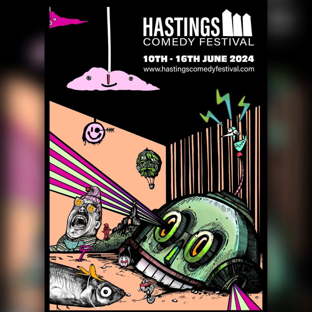
So, be creative and try to come up with something that really jumps off the page. Be bold and don’t be afraid of garish colours – they can be your friend. The Hastings Comedy Festival poster by Georgie Wheeler is a great example here.
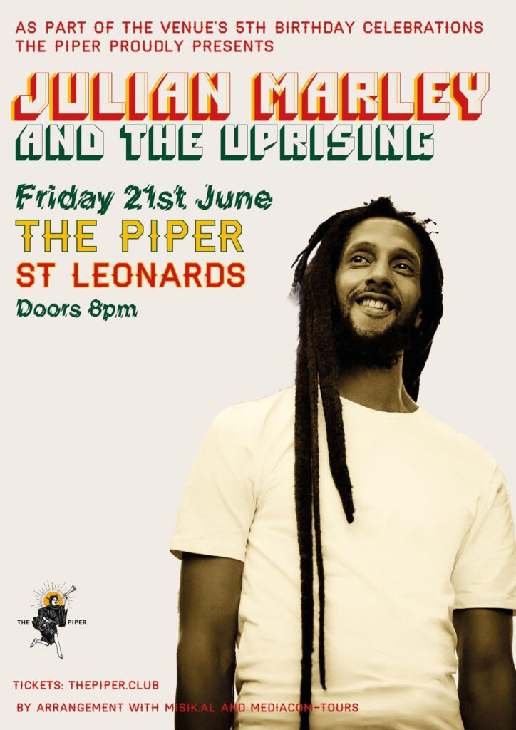
At the same time though, if the venue or the band has strong brands or logos, you should leverage the time they’ve invested in building this brand by incorporating it into your design. Take a look at The Piper – they’ve put a lot of time into branding and you can tell one of their shows a mile off. The Julian Marley gig makes perfect use of a strong and easily recognisable image of the performer.
Alternatively, if you are promoting a new band with no clear ‘image’ and needs an explanation, you need to think about whether to do this visually or through text. Remember that people rarely spend time reading things, so if you do go down the text route, keep it short and punchy. Something along the lines of, “If you love Hawkwind, you’ll love these guys.”
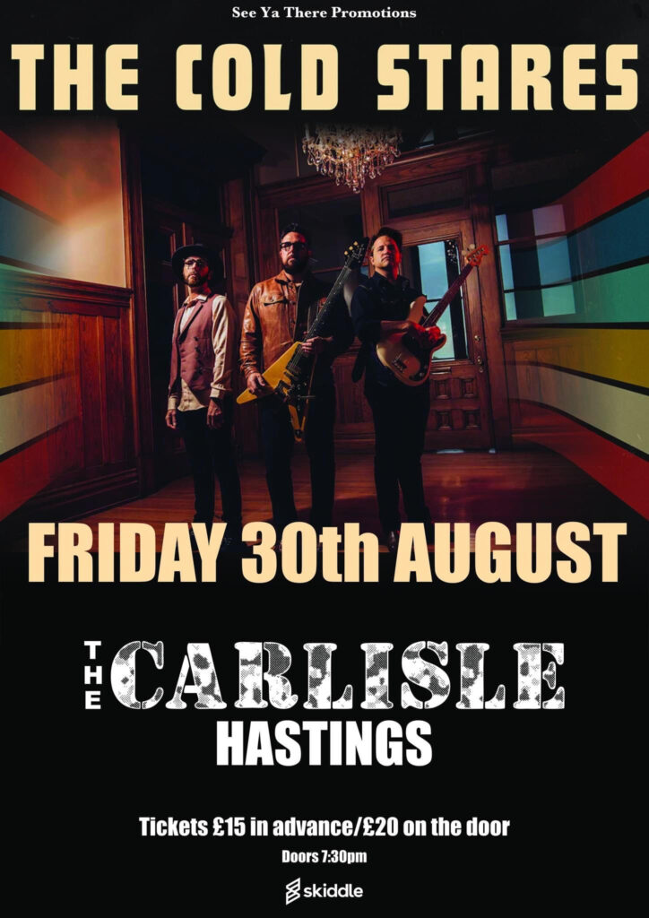
However, if you are trying to ‘sell’ the band with images and graphic design, then what you need to do is think about how to get this same message across by replicating the feel of old prog-rock album covers or something similar. The poster for the Cold Stares’ show at The Carlisle takes advantage of a good photo supplied by the band that provides a fairly powerful idea of what sort of music will be on offer.
My final tip is to finish your design, sleep on it and look at it in the morning. Imagine you are seeing it for the first time in a shop window. Ask yourself, “did that tell me everything I needed to know at a a glance?” If the answer is “no” then it’s back to the drawing board.
So what makes me such a fan of this artform? Well in a way it’s because it’s so fleeting and disposable, at the same time as being something that has the potential to be a future collectible. It’s also utilitarian and has a purpose at the same time as requiring a particular set of aesthetics where ‘form’ and ‘function’ need to work together–or the fundamental brief has been missed. Not every gig poster will be a future masterpiece in the same way that not every band goes on to become a Glastonbury headliner, but the potential is always there.
Go to www.hastingsflyer.com for listings and select ‘Hastings Gig Posters’ to browse the collection.
We hope you have enjoyed reading this article. The future of our volunteer led, non-profit publication would be far more secure with the aid of a small donation. You can also support local journalism by becoming a friend of HIP. It only takes a minute and we would be very grateful.

Leave a Reply